Well, whaddya think?
So, after hours of pondering, tweaking, and contemplating tossing my computer (not to mention alternately badgering and complaining to Mr. Anglosaxy), I've managed to create a new look for Something Something. There's still a bit of cleaning up to do, and I'm still trying to figure out how to add photos to the header without everything going totally wonky, but essentially, it's done.
Well, whaddya think? Do we like it? I wanted to add some color without making it look tacky (and the line between slick and tacky is rather thin, dontcha know?). Suggestions are welcome, especially from people who can match colors and create brilliant color schemes. Sadly, I'm not one of them, and relied on the color palette's automatic display of colors that matched whatever color I happened to be using at the time. Truly. If there was a Garanimals line of clothing for adults, I'd be a totally dedicated customer...
Here I go, running at the mouth (running at the fingers?) again. I do have to run, as it's time to start thinking about dinner for the Little One (not to mention his mother and father). I'll be back soon enough, though, and when I do return, I expect to start seeing your comments trickle in. Don't make me come over there...


15 comments:
It's nice and I like the wider format. The grey on blue is a little hard on the eyes though.
I like the layout, but agree with Lisa about the font...too little contrast for readability.
sorry to rain on your parade, but I don't like it. Too hard to read, too spread out, no clear division between the sections on the left, washed out color, etc.
even though i said all that, can I borrow the Patricia Cornwell when you're done with it?
I agree...the font is harder to read, and your words are worthy of a sharper image. I switched over as well and putting up photos in the header - i have one, but i'm not sure how. I know it involved my boyfriend, many french curse words which i did not understand and about an hour. if you figure out an actual real way...lemme know! nice new look :)_
PS I noticed that the links visited color is purple. What about using two or max three colors, and then making the other colors lighter shades of the first two?
I am writing this before you might come over here, espcially now that you already done three (3!!!) full self defense lessons ...
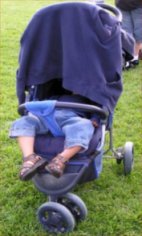
The picture of the little one is getting out of the frame. Seems like a template issue (probably places not within a "well balanced html tags" or something like that.
As for the color and fonts... being a man I hardly notice those things ;). Though, I do not expect it to be black on yellow (for sharpness).
I like the brown type on the blue background. Why don't you do the titles and such in blue and the actual text in the brown? Easier on the eyes and a great color combo (I love blue with brown!)
I think it looks great! Love the blue, and wider is definitely better. I've been meaning to do something like that to my blog but laziness always prevails.
The tweaks (black text, brown titles) definitely work. Nice.
MM i think its nice the way its more spread across the page. But I thought 'hospital' when I saw the light green background.
The greyish scale you had before was nicer.
OK but a bit wide which seems to have a negative effect when reading. Otherwise looking good.
I like it. Tasteful. Well done.
No opinion on the new layout, followed the link from NC's blog to see if I could leave a comment...
I am a little late, but I like it better than the old version!
Post a Comment